I have always found maps to be interesting. Whether it was a nautical chart or fold out road map in the back seat of a car, I spent quite a bit of time looking at maps as a child. Even when I go somewhere today, I will often bring back a map as a souvenir.
On a recent work trip in Australia, I found myself looking at a painting in a shop that sold Aboriginal art. Much to my surprise, I was informed it was a map!
Kangaroo Dreaming - Lee Rehardt, Queensland, 2023
An employee of the shop explained to me the meanings of the symbols and shapes and how the map would have been used. The large circle made up of dots in the center and two smaller circles in the upper right and lower left represent camp sites. The black U shapes are hunters around the main camp site, and the arrows pointing outward are kangaroo tracks. The more ornate blue circles in the upper left and lower right corners represent water holes. (Thankfully, the artist, Lee Rehardt from Queensland, included a legend to help others understand the map.)
 Kangaroo Dreaming - Lee Rehardt, Queensland, 2023
What does any of this have to do with telecommunications?
Visual aids for telecom networks come in all forms. They may be maps in the form of what we think of today, or they may be some other form of diagram, schematic, or graphical representation. However, they all serve a purpose—to help the user visually understand the network. In fact, some of the earliest forms of visual aids of telecom networks may not have been maps at all, but instead diagrams depicting how information traveled across the network starting at a central office, flowing through splices, branching off, and feeding points of presence, substations, and ultimately the end customer.
As networks and technology have evolved, looking at modeling networks in a geographical context has become more common. However, in some cases it has left the industry with two sets of records to maintain—the map and a diagram. This leads to additional upkeep, misalignment, and then the question I have heard more than once from operators: “Which one is right?”
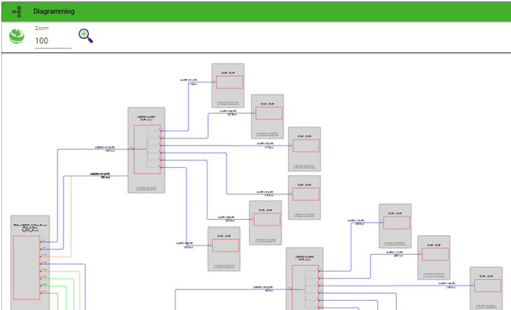
A single source of truth that visualizes network data on both a map and in a diagram is not only practical but also more efficient, as it eliminates guesswork. This is where 3-GIS | Diagramming comes in. With this tool, users can model the network geographically and generate on-demand diagrams that display connectivity at the fiber and port levels—all from one interface.

3-GIS | Diagramming output
Regardless of the network topology, a diagram based on the configuration defined by your organization can be created and exported to share with others. The layout, labels, and symbols are configured based on templates, so you can visualize your network in multiple ways. Once generated, each user can adjust the layout to fit a specific need. Just like the rest of the 3-GIS products, configurability NOT custom code is key. All this functionality is set up and configured using 3-GIS | Admin.
 3-GIS | Diagramming configuration using 3-GIS | Admin
While maps have been captivating to me since childhood, my recent encounter with an art piece turned map underscored the diverse ways in which maps convey information. Similarly, in telecom, visual aids play a crucial role in understanding complex networks. By seamlessly integrating geographical mapping with detailed network diagrams, we embrace a singular record of truth, paving the way for enhanced clarity and productivity in network management.